Introduce? Unveil? Announce? Anyways, we've got our first deep learning model to share
Getcha beta sign-ups here!
We’ve been writing for about a year now and when a post veered into more quantitative waters, it was generally underpinned by Tim working in Excel. Don’t get us wrong, Excel is great—communication ✅, trust ✅, physical intimacy ✅, curiosity ✅, conflict resolution ✅. But its suitability for blog posts doesn’t extend to machine learning and ML engineering.
So as Tim wrote, he dropped hints that his co-founder, Yamaç, was working on a proper ML product. And today we’re really excited to launch a public beta for our first model.
What is it? And what is it not (yet)?
We trained a deep learning model to predict airport arrival capacity, deployed it to the cloud (so that it can infer in real-time) and built a simple frontend that visualizes the results. If you’ve been reading our Substack for a time, you know that we have a complicated relationship with Newark Airport (EWR)—so naturally we chose to start there.
While we’re curious if airports can be featurized—such that the same algorithm outputs predictions for multiple airports—even by itself, our EWR model is trained on a billion data points.
Given how frequently we reference weather and its various models, you’ll likely be unsurprised to learn that ingesting NOAA’s high-resolution rapid refresh (HRRR) is a critical pipeline. There’s tradeoffs (refresh rate, time steps, subscription cost, ensembling), but we think it’s an appropriate solution for an MVP: it allows us to re-forecast capacity once per hour (around the 12th minute of the hour) and provide predictions in hourly time steps out to 15 hours in the future.
For the moment, the model assumes all runways are open, though we’re a couple days away from switching on the pipeline that will read runway status from NOTAMs. We’re also working on the pipeline that ingests actual arrival rates for a window leading up to our prediction. We’ll share on Twitter (provided it’s still around) when these pipelines are up and running.
As for the model itself? Well that’s sorta the secret sauce, but we will share that it’s based on the same transformer architecture that’s made headlines recently as it relates to generative AI.
If readers aren’t surprised by the initial focus on EWR or the HRRR’s prominent role, they might be surprised to see point estimates of arrival rates. After all, we’ve spilled a fair bit of virtual ink to convey uncertainty… bets, odds, chances, probabilities are oft-used words. So why the single, best estimate of capacity and not a more probabilistic product (e.g. communicating low- and high-end rates)? We’re evolving our model architecture to better quantify the uncertainty around predictions, but Yamaç only has so many Jupyter notebooks. We’re just as excited to iterate as we are to launch and to do the former—with the benefit of feedback—first requires the latter. To that end, we wanted to launch as soon as it contained some value that otherwise doesn’t exist; we think the point estimates satisfy that criteria.
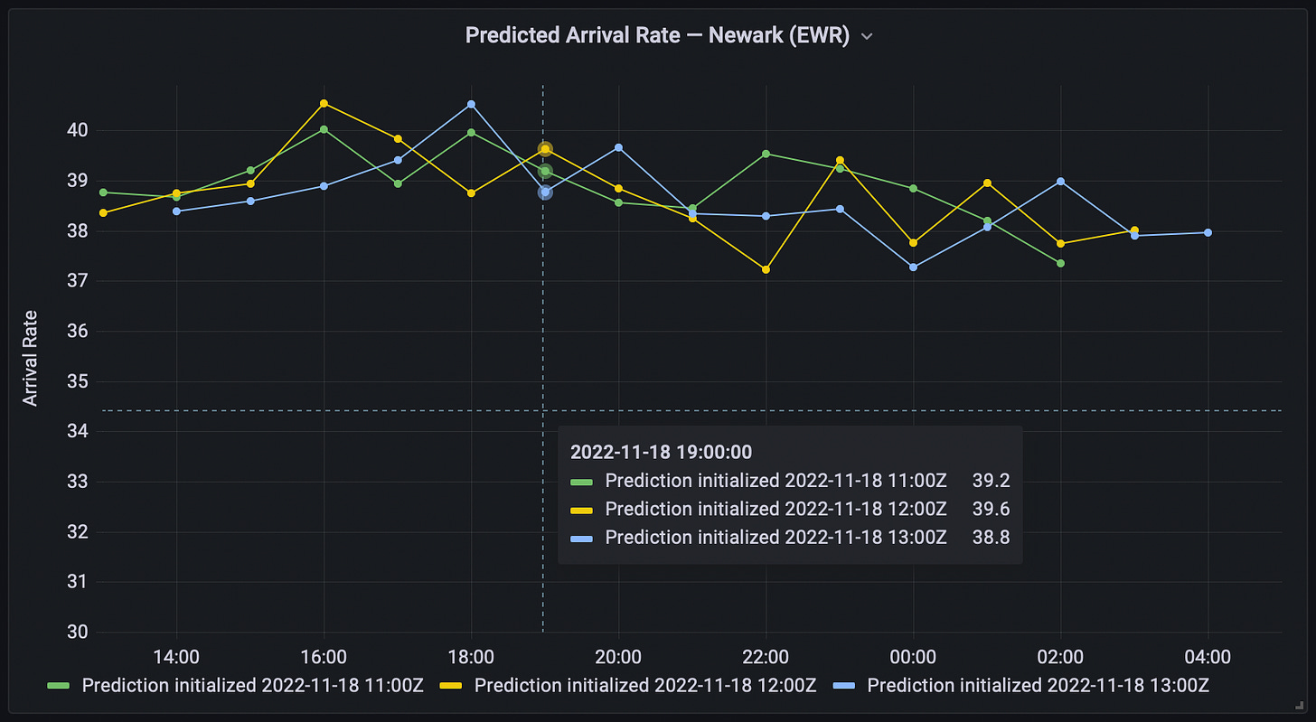
In the meantime, we’ve charted the three most recent initializations to convey some sense of uncertainty. A relatively wider spread in predicted values for the same valid time (e.g. the 22:00 hour above—it’s in UTC) should be interpreted to mean there’s greater uncertainty. Conversely, more tightly grouped initializations (e.g. 17:00 hour) suggest higher confidence on our part.
Cool. What can I do with this?
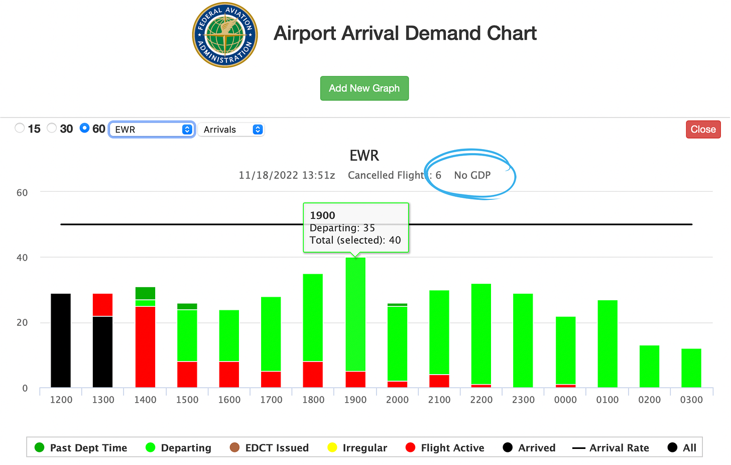
Admittedly there’s an interpretability hurdle for travelers, especially. For both operators and travelers, we think probabilistic predictions will significantly increase utility. For now, we’d recommend travelers pair our predictions with the FAA’s airport arrival demand chart (AADC), which helpfully encodes hourly arrival demand by way of the stacked columns. It’s an important piece of information—and not yet piped into Aerology—to triangulate capacity, demand and [more-interpretable] delay. Low capacity by itself isn’t necessarily problematic; it’s only when capacity falls below demand that queueing (read: delays) results.
The black horizontal line forecasts the same arrival rate as our dashboard—but reflects the FAA’s outlook. Essentially, we’ve challenged ourselves to forecast rates set by the FAA more accurately than the FAA themselves. Fortunately for the prospects of our burgeoning company, indications are we can do so with a good degree of success. We ultimately want to benchmark using a deployed model, though need to finish the arrival rate pipeline (and collect a sufficiently large sample); in the interim, a trained-but-not-yet-deployed model looks to reduce forecast error by as much as 44%1.
Much of this outperformance likely owes to the FAA's wait-and-see approach to ground delay programs, or GDPs. From where the FAA is sitting, this optimism is largely defensible—it minimizes the chances that they’ll introduce unnecessary delay to the national airspace system. But shifting that decision right—nearer the potential capacity/demand imbalance—costs operators optionality in how they distribute delay (if metering traffic does prove necessary). And loss of operator optionality also flows through to travelers, whose best rebooking alternative might depart before the delay is published.
After sending two or three outlooks per week since August, we think this beta launch is a good opportunity to re-evaluate Substack cadence and content. We want to be metrics-driven and the shorter, more frequent outlooks didn’t really grow subscriber numbers. Now that we have a product we’re iterating on, that figures to provide some previously-inaccessible content. And we might return to the in-depth outlooks for peak travel dates (or author a post on macro trends). So we’re not entirely sure what Substack looks like for us going forward, but we’ll still be writing.
Aerology is, for the moment, unconstrained by this wait-and-see gamble; we’re just making our best estimate of capacity, unbiased by optimism. (And our probabilistic predictions will enable a more scientific, tactical wait-and-see approach… call it hedge-and-see.) So, if the AADC denotes “No GDP”—like the screenshot above—and Aerology’s forecasted rates differ substantially from the FAA’s outlook, we’d bet they’re waiting for some trigger (perhaps demand to exceed some threshold or an updated weather forecast) to publish reduced rates.
Take, for example, the 19:00 GMT hour in the two charts above. Aerology had most recently predicted a rate of 38.8 at 13:00 GMT (which would have been visualized at 13:12); forecasted capacity for the 13Z hour trended generally downward from the previous two initializations (39.2 to 39.6), though not so erratically as to convey high uncertainty. The FAA, for their part, was publishing a 50 arrival rate at the time. Arrival demand was estimated at 40 (less a forecast and more an accounting). If predicted capacity is below both the FAA’s forecasted rate and estimated demand, it’s an indicator that unpublished delay exists.
This can also be the case if a GDP is active and suggests a downward revision to the program may be forthcoming—which would increase delays. If, on the other hand, Aerology’s predicted rates are higher than the FAA’s outlook, we might see an upward revision or cancellation of the program. But delays are sticky. Passengers scatter, agents are reassigned, gate changes are made: It’s the reason the FAA and airlines are inclined to publish a delay only when they’re nearly certain it will occur. Expect the FAA to be quicker with downward revisions than rate increases (or cancellations).
Now the exciting part
We think there will be a step change in traveler interpretability—and therefore utility—when we’re providing probabilities that capacity will be lower than currently-published rates. And another step change when our output is not just capacity, but also delay. However, iterating takes weeks (in the case of probabilities) or months (to reach delay predictions) and we have a product to share today! So comment below or email Tim (tim@aerology.ai) and we’ll get you set up with a username and password; the dashboard is an otherwise publicly accessible website (nothing to download, no VPN required). We intend to leave the beta open for a few weeks, after which point it will be, at least partially, moved behind a paywall.
And it’s just that: A beta. So please expect (and report!) any bugginess. To that end, don’t limit feedback to bug fixes—what would improve the usefulness of the product? As we referenced above, feedback from users is critical to successful iteration. (Perhaps particularly helpful beta users get an extra week of beta access.)
🚀,
Yamaç & Tim
As measured by root mean square error (RMSE) across 180 days in Aerology’s test split; performance varies by lead hour (though Aerology outperforms at all lead hours). Planned FAA rates reconstructed using archived messages from FAA’s SWIM data-sharing platform (though some messages may be missing—a problem that shouldn’t exist in deployment). Some dates from Aerology test split pre-date availability of archived SWIM messages.
Model not yet deployed because it requires pipelines for both NOTAMs and preceding capacities.


This is quite exciting. In my decades as chief ATC Coordinator for United Airlines I consistently argued that the excuse of “unnecessary and unrecoverable” delay used to wait out a TMI decision point was a mistake. Of course this argument was usually espoused by carriers who would take little of the delay if we lost the wager. I’m also interested in whether your model uses ITWS type of data to forecast the impact of low level winds on approach that can cause compression on final. And lastly, it might be interesting to infer quality performance patterns by ATC as related to controllers, front line managers, and TMU specialists work schedules.